
Fueling the future: A product-driven website redesign
Ballard Power Systems is a key player in zero-emission fuel cells. Having made significant investments in R&D, the company is now concentrating on bringing its market-ready products to the forefront.
I led the ux and strategy for Ballard Power Systems' new website, transitioning it from a research-focused platform to one that highlights both their products and their position in the marketplace. This role involved collaborating with stakeholders, conducting research, and redesigning the site to effectively showcase where Ballard is today. The project is still in progress and is set to launch soon.
Opportunity areas
I explored different solutions that would make it easier for users to find the right products for their needs while positioning Ballard’s offerings as ready for deployment.
Shifting to be product focused
Storytelling with accessible content
I needed to create alternative methods for users to connect with and access information without feeling overwhelmed, ensuring the content was both engaging and accessible.
Setting Ballard apart
I had to find moments in the website to showcase these competitive advantages to build credibility and resonate with the target audience, setting Ballard apart in the marketplace.
Product focus
Site Navigation
Based on feedback from users and various teams, I discovered that Ballard required a more effective method to showcase products by both family and application use cases.
To solve this, I designed a navigation system supporting dual search methods. I created an intuitive, exploratory menu that enables users—such as engineers, procurement specialists, and fleet managers—to easily find products by specific use cases or explore product families by stacks and modules.

Product focus
Product finder
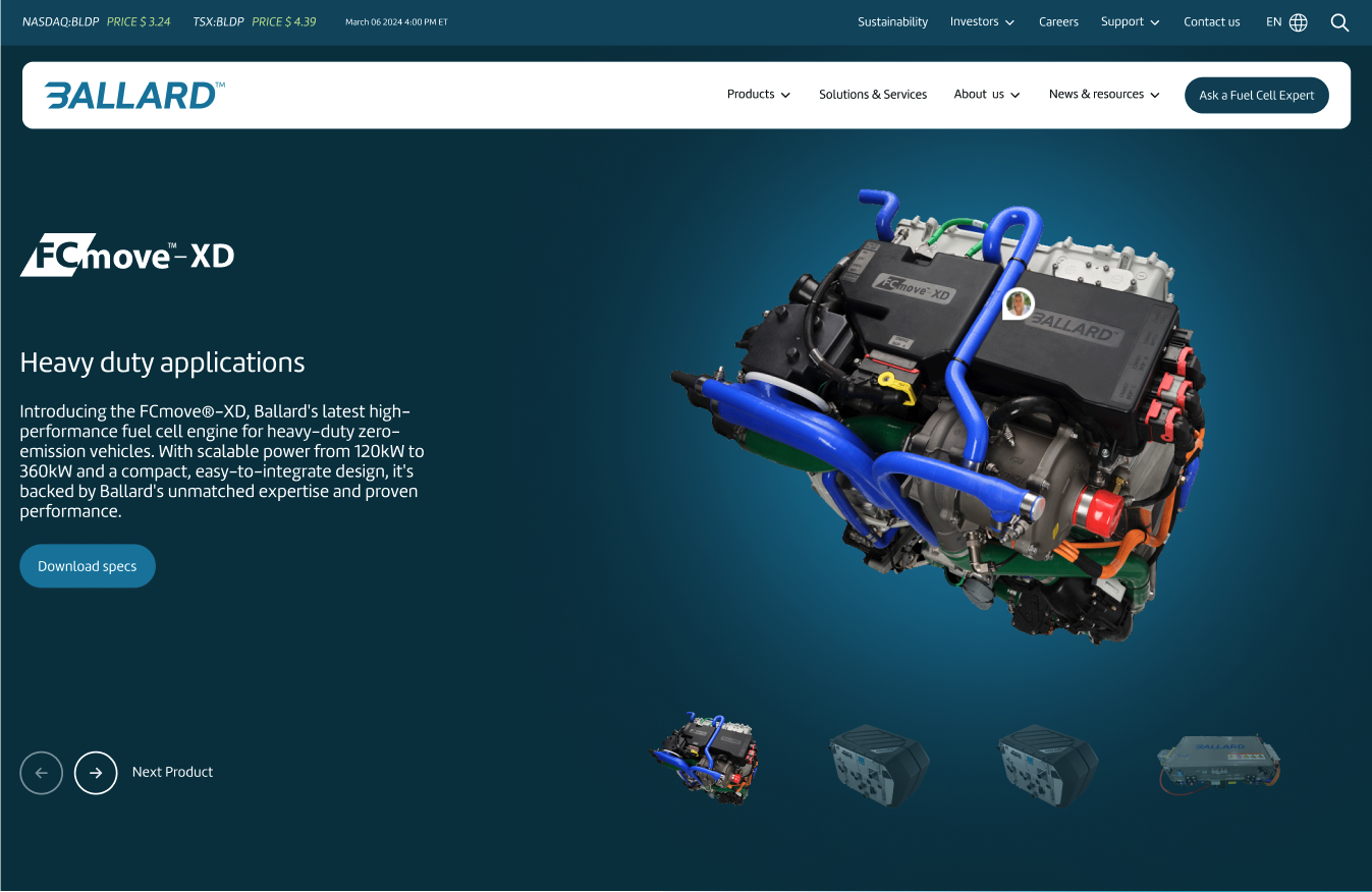
To make it simple for users to find the right product and specs, I explored different ways to present the information. The product finder was designed to be intuitive and user-friendly, so visitors can easily get all the details they need to make the right choice for them.

Product focus
Accessible info & better product display
I concentrated on making product information easy to find and understand by designing clear, visual displays that highlight key features.
Additionally, we guided Ballard to provide more visually appealing and consistent product images and renderings.
Each product page also includes links to related applications, FAQs, and support resources, ensuring users have everything they need to learn about the products without feeling overwhelmed.
Storytelling
Bringing motion to the brand
I incorporated motion into various elements of Ballard's static brand guidelines to add depth. For example, I used a moving gradient to symbolize the exchange of electrons in fuel cells and the mobility these cells enable. On the homepage, I introduced a motion cursor and rotating carousels to showcase case studies and product experiences, making the site feel dynamic and alive.


Storytelling
Reducing redundancies
I condensed the investor information from 10 separate pages on the original website into a centralized section, which linked to a comprehensive document library. This made the information easier to access and eliminated the need for users to navigate through multiple pages, reducing redundancy while preserving the content's value.


Storytelling
Creating a narrative flow for key sections
I designed the sustainability section to clearly communicate Ballard's efforts towards a cleaner future by featuring links to the latest ESG report and showcasing commitments upfront.
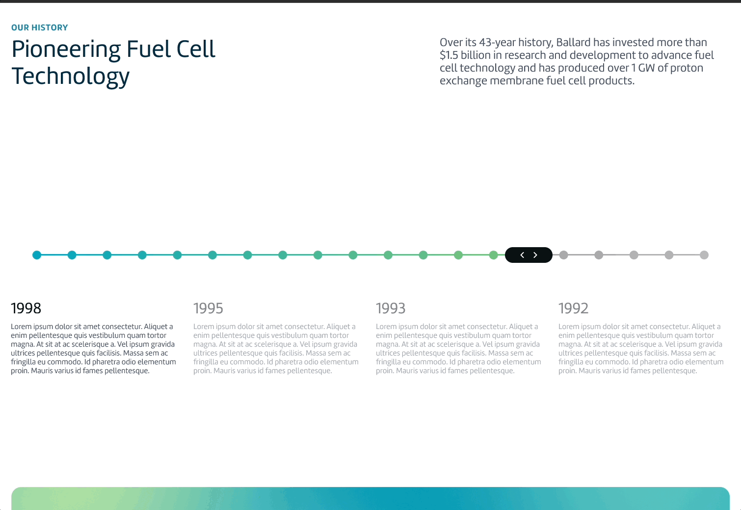
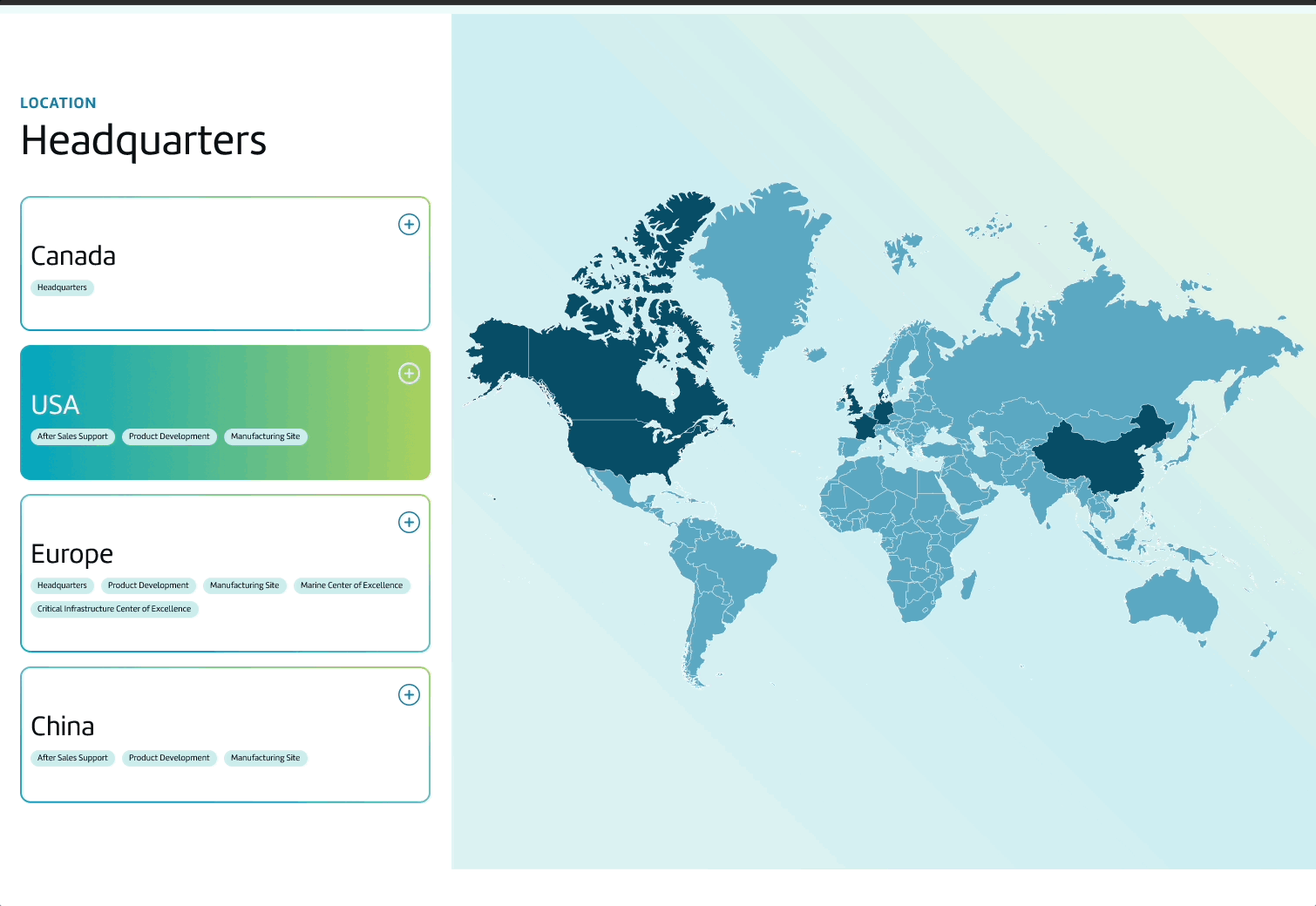
I also restructured the "About Ballard" page to succinctly convey their identity, using an interactive timeline to highlight their history and design elements to showcase their global presence.

Set Ballard Apart
Highlighting Ballard’s competitive edge
I emphasized Ballard's competitive edge by focusing on finding ways to showcase their commitment to "Proven Performance and Promise".
I provided impactful details about the proven quality of their products and showcased case studies to quickly highlight product adoption and performance. Additionally, I highlighted their dedication to customer support, emphasizing their end-to-end service to ensure customer satisfaction.

Set Ballard Apart
Speaking the user's language
I rephrased internal Ballard terminology into language that’s more user-friendly, making product benefits clearer and more aligned with user needs. For instance, I replaced terms like “market” with “application” and designed the product finder to be intuitive, offering language that is more human instead of relying on traditional product filters.
The main call-to-action, “Ask a Fuel Cell Expert,” connects users directly with real people, adding a personalized touch to the support experience.


Some things I learned.
I learned how to translate print design standards into a digital format while maintaining brand integrity. It’s a delicate balance between adapting the brand and staying on-brand.
I worked closely with various teams—ESG, People and Culture, Sales, Marketing, and Product—to ensure that everyone contributed and felt heard, while also driving the project forward. Getting everyone on the same page is challenging, and it requires finding different ways to present information to different stakeholders.